Levis // Ecommerce App
Project:
As Levi’s increased focus on growing its direct-to-consumer business amid a declining wholesale landscape, we identified an opportunity to establish a new mobile first channel. I led the design of Levi’s first ecommerce app, creating a foundation that bridged in-store and online experiences while supporting a scalable, global omnichannel brand ecosystem.
The app was conceived as more than a transactional surface, enabling features such as exclusive app-only drops, loyalty, find-in-store, and appointments with stylists, all designed to deepen engagement and strengthen the direct relationship with customers.
Why An App:
Research and performance data revealed a growing split in customer behavior. The desktop and mobile web experience continued to serve an older, replenishment driven customer, while a younger audience increasingly expected discovery, exclusivity, and a more expressive brand experience.
Rather than forcing a single experience to serve incompatible needs, we intentionally designed the app as a complementary ecosystem, one that could move faster, express the brand more boldly, and support behaviors like loyalty, exclusive drops, and in store connection without compromising the stability of the core site.
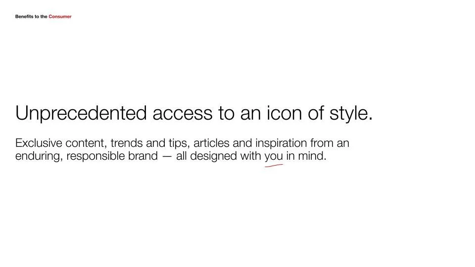
The Value Propostion:
The Levi’s app delivers a more personal, expressive connection to the brand by offering exclusive access to products and content, rewarding engagement through loyalty, and tailoring the experience to individual customers. It repositions Levi’s from a place to shop into a platform for ongoing relationship and discovery.
Evidence & Outcomes:
The app consistently outperformed the site, delivering approximately 3 percent higher performance, stronger engagement, and higher lifetime value. It also attracted a younger customer cohort, validating the decision to invest in a more expressive, mobile first experience.
Beyond performance, the app became a proving ground for modern interaction patterns and visual language that later informed broader ecosystem decisions, including how the site could evolve without alienating its core replenishment audience.
The Value Proposition


For the app we focused on a more fashion forward consumer


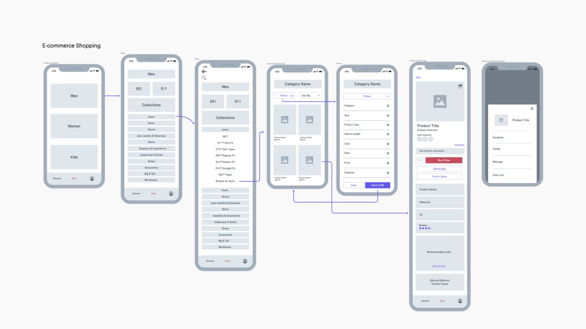
UX Model
We created a plane system for our app ux model. The plane heirarchy we created:
Foundation Plane
A user-centric conceptual base layer highlights the personalized nature of the app.
Loyalty Bank
Profile / Account
Core Experience Plane
A destination that houses all of the primary destinations and benefits of the appl.
Discovery
Category Doorways
Category Gridwalls
Loyalty Earn
Cart
Primary Navigation
Leveraging a classic tab navigation paradigm allows users to move quickly within established ux patterns.
Access to Core Experience Use Cases
Focus Plane
A secondary layer allows for deep dives into content and functionality above the core experience plane.
Editorial
Product Drops
PDP
Filter & Sort
Checkout
The cms module system we created allowed our brand team the ability to have a richer product pages that could stand out from our standard ones. This was implemented on or product page as well as the product grid.
Above you see a regular product page and a Peanuts collaboration product page
Ecosystem Impact
The app became a proving ground for modern interaction patterns, performance expectations, and brand expression. Learnings from the app informed how the core site could evolve responsibly, maintaining stability for replenishment users while gradually adopting a more expressive, systemized approach.
We also used the app as an opportunity to increase account sign ups by offering a new loyalty program. This allowed us to get more signed in users and gave us the ability to start collecting data for personalization.